
Interior Painting Tips
Paint Colors To Avoid In Painting Your Guest Room in Newtown, PA | PAINT Philadelphia
July 24, 2024
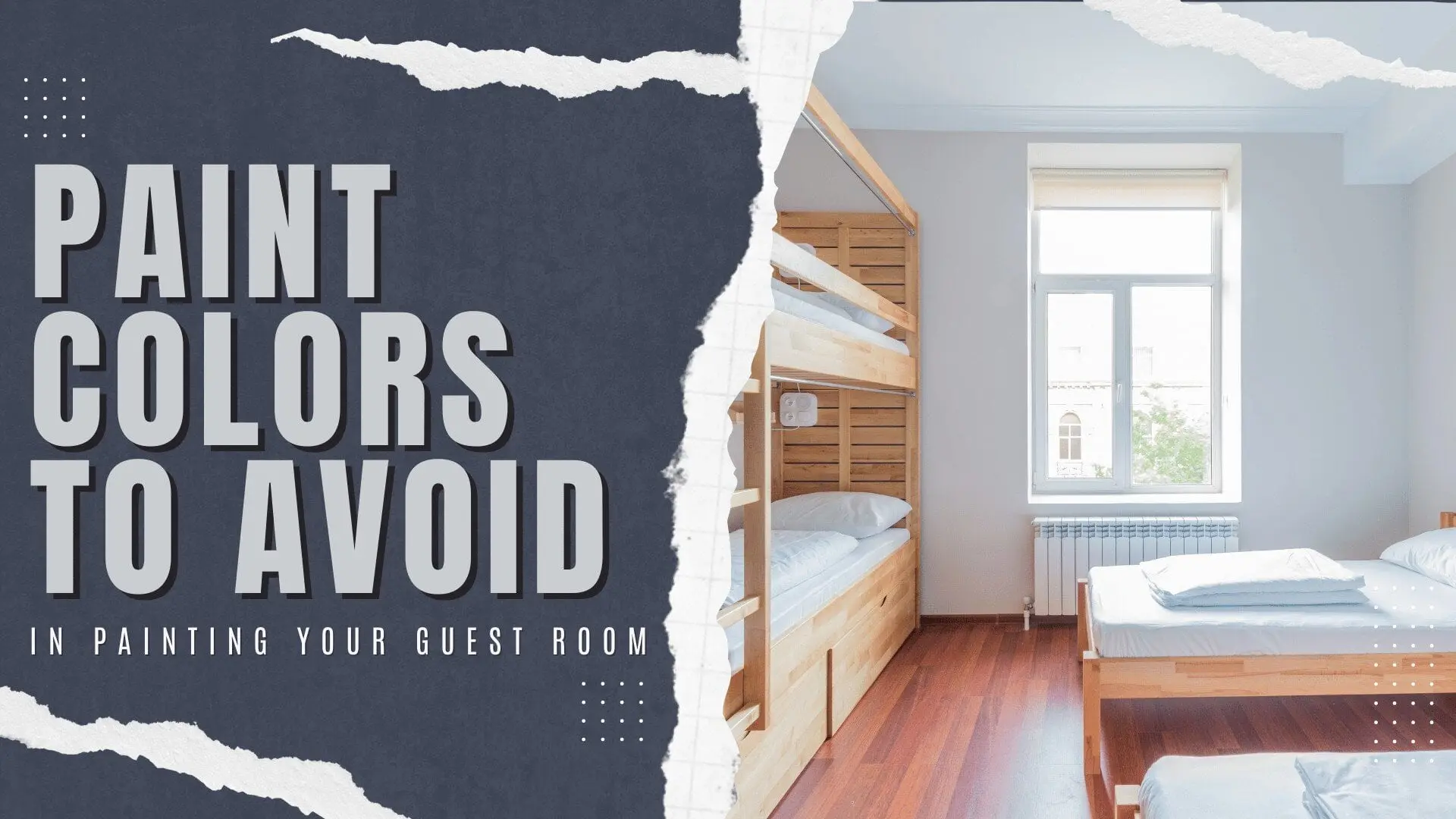
Painting your guest room is more than just a cosmetic update—it’s about creating a space where friends and family feel truly at ease. In neighborhoods like Newtown, PA, where traditional homes and historic charm define the area, the right color choice can enhance the warmth of your space while the wrong one can make it feel cold, cramped, or even a little stressful. At PAINT Philadelphia, our interior painters help homeowners in Newtown, Holland, Richboro, and across the broader Philadelphia region choose colors that feel timeless, calming, and welcoming.
Below is an in‑depth look at paint colors you should avoid in your guest room, along with thoughtful alternatives that work beautifully in suburban homes around Philadelphia.
Why Guest Room Color Choice Matters
Your guest room is often the first room visitors experience once they step inside your home. Whether it’s an overnight stay or a weekend visit, the walls play a subtle but powerful role in how people feel. The right color can promote relaxation, improve sleep quality, and make the space feel larger and brighter. In older homes common in Newtown and nearby suburbs, factors like window size, ceiling height, and existing finishes can all influence how paint behaves once it’s on the wall.
Choosing wisely also has long‑term benefits, especially if you’re considering resale. Homes in the Philadelphia region increasingly favor neutral, soothing palettes that feel modern without chasing passing trends. A well‑planned color scheme can help your guest room feel both inviting and enduring.
1. Overly Warm, Intense Reds
While red is often associated with energy and excitement, particularly bold or warm reds can dominate a small guest room. Bright brick red, fire‑engine crimson, or deep tomato can feel overwhelming, especially in spaces with limited natural light. Red has also been linked to increased heart rate and alertness, which is the opposite of what you want in a sleeping area.
In homes in Newtown and nearby parts of Philadelphia, where guest rooms are often tucked into corners of the house, these shades can visually shrink the space and create a sense of visual “heat” that feels uncomfortable rather than cozy.
Better alternatives
-
Soft dusty rose or muted terra‑cotta
-
Warm berry or maroon used as an accent wall
-
Light coral or blush tones that add warmth without intensity
These red‑leaning tones keep the room feeling warm and inviting without overwhelming your guests.
2. Extremely Cool, “Icy” Grays
Cool, blue‑based grays have become popular in modern interiors, but they can be harsh in a guest room setting. Icy gray, slate‑gray with strong blue undertones, or steely cool grays can feel cold and impersonal, especially under overhead lighting or in homes with limited daylight. In many older Newtown homes, these grays can also make walls look dull or slightly dirty, especially as they age.
Why they’re problematic
-
They can feel minimalist and clinical instead of restful
-
They tend to cast a bluish or greenish cast on skin tones
-
In dim light, they can appear flat or lifeless
Better alternatives
-
Greige (gray‑beige blends) with warm undertones
-
Soft warm gray with a hint of beige or brown
-
Light stone or warm off‑white for a softer, more timeless backdrop
These options retain a modern aesthetic while feeling much more gentle and soothing.
3. Pure, Stark White on All Walls
Although white is often seen as a safe, neutral choice, pure, stark white can backfire in a guest room. All‑white walls can make the space feel cold, sterile, and even hospital‑like, especially if there’s not enough natural light. They also show every smudge, dust line, and imperfection, which means the room can look worn quickly if not cleaned constantly.
In many homes in Newtown and the Philadelphia area, staining from old fixtures or scuffs can become more noticeable on ultra‑bright white, which can detract from the overall experience.
Better alternatives
-
Warm white or eggshell white
-
Soft cream or ivory
-
Light beige or warm neutral with a hint of yellow or brown
These shades keep the room feeling bright and airy while adding a touch of warmth that feels more inviting.
4. Ultra‑Dark, Moody Hues
Dark charcoal, inky navy, or deep chocolate brown can look dramatic in design magazines, but they rarely translate well to a guest room. Dark colors absorb light and can make a small or already‑dim room feel enclosed and oppressive. In many older homes around Newtown, where guest rooms often sit toward the back of the house, dark walls can exaggerate the sense of limited natural light.
Use with caution only if
-
The room receives ample natural light
-
The ceiling is white or very light
-
The trim and furniture are kept light and reflective
Better alternatives
-
Soft navy or muted indigo on one accent wall
-
Warm charcoal or taupe used sparingly
-
Deep forest green or muted purple as accents rather than full coverage
These options preserve the cozy, moody vibe without making the room feel cave‑like.
5. Harsh, Cool Blues and Greens
Cool, icy blues and greens can look refreshing in theory, but in practice, they can feel sharp and impersonal. Very light, cool blue can feel like a hospital or office backdrop, while green‑leaning tones can evoke a sea‑foam or “cold” effect that clashes with warm lighting and natural wood tones. In many suburban homes in the Philadelphia region, these shades can feel dated or mismatched with existing finishes.
Better alternatives
-
Soft sky blue with a hint of warmth
-
Sage green or muted olive green
-
Pale teal or muted aqua
These cooler tones keep the space fresh and calming without feeling sterile or clinical.
6. Neon and Fluorescent Tones
Neon pinks, electric yellows, and fluorescent greens are fun for artwork or accent pieces, but they rarely work well as main wall colors. They create visual “noise,” which can make the room feel chaotic and mentally fatiguing. In a space meant for relaxation, that kind of stimulation can prevent guests from winding down.
Better alternatives
-
Use neon colors in:
-
Accent pillows
-
Small rugs or throws
-
Artwork, mirrors, or accessories
-
-
Keep the walls neutral and soft, then let the accents pop
This approach keeps the space modern and playful without overwhelming your guests.
How to Choose the Best Guest Room Color in Newtown, PA
If you want to avoid the colors mentioned above and still create a distinct, attractive space, follow these practical steps:
-
Audit the lighting
-
Does the room get morning, afternoon, or limited light?
-
Test swatches at different times of day and under both natural and artificial light.
-
-
Consider the room size and layout
-
Lighter, warm tones help small rooms feel larger.
-
Dark colors are best reserved for larger, well‑lit spaces.
-
-
Think about your guests’ preferences
-
Neutral, calming palettes are usually the safest choice.
-
Avoid overly personal or niche colors that may not appeal to a wide range of visitors.
-
-
Match the color to your existing finishes
-
Warm hardwood floors pair well with warm neutrals.
-
Cooler tile or flooring works better with balanced or slightly cooler grays.
-
-
Test physical samples
-
Paint a 2×2 foot square on at least two walls.
-
Let it dry for a full day and observe how it looks in different light.
-
The team at PAINT Philadelphia regularly tests high‑quality paint brands in homes across Newtown, Holland, and nearby suburbs, helping homeowners select colors that look consistent and professional in every lighting condition.
Recommended Color Families for a Guest Room in Newtown
For a guest room in Newtown, PA, consider these versatile, welcoming color families:
-
Warm neutrals: ivory, beige, greige, soft taupe
-
Soft pastels: muted blue, blush pink, sage green
-
Earthy tones: terracotta, warm clay, soft brown
-
Muted blues and greens: soft sage, muted teal, light slate
These palettes are easy to decorate around and tend to age gracefully, which is especially important for homes in the Philadelphia region that may be on the market in the future.
Frequently Asked Questions
1. Why are some colors more unwelcoming in a guest room?
Certain colors—like very dark shades, icy cool grays, or bright neon tones—can subconsciously affect mood and perception. Dark rooms can feel closed‑in, while cool or overly bright colors can feel sterile or overstimulating. In smaller guest rooms common in Newtown and the Philadelphia area, these effects are more pronounced and can make guests feel less relaxed.
2. How do local styles in Newtown, PA, influence paint color choices?
Newtown’s historic homes and traditional architecture tend to favor soft, timeless palettes. Overly modern or bold colors—such as neon or ultra‑bright hues—can clash with the neighborhood’s character. By choosing colors that complement the area’s charm, your guest room will feel inviting and harmonious with the surrounding community.
3. How does natural light affect which colors to avoid?
Newtown’s changing light conditions mean that certain colors can look very different in the morning, afternoon, or evening. Cool or gray‑based tones can appear flat or dull in low light, while very bright or cool colors can look harsh in direct sunlight. Warm neutrals and soft pastels tend to look more consistent and welcoming throughout the day.
4. Why should you avoid trendy or overly personal colors in a guest room?
A guest room is a shared space, so it’s best to choose colors that most people will find comfortable. Trendy or highly personal colors—like vivid orange or bold statement walls—can polarize guests and date quickly. Timeless neutrals or soft, muted tones give you a flexible backdrop that feels welcoming to everyone.
5. Can paint color affect the perceived size of a guest room?
Yes. Deep reds, blacks, or very dark purples can make a room feel smaller and more enclosed, especially in spaces with limited natural light, which is common in many Newtown homes. Light, warm neutrals or soft pastels can create the illusion of a larger, airier space, which guests typically appreciate and makes the room feel more comfortable.
If you need professional help with your interior/exterior painting project, PAINT Philadelphia can help.
Our home interior/exterior painting services are available in Newtown, Holland, and Richboro, PA.
Related: Guide To Repainting The Faded Paint On Your Bedroom in Newtown, PA
Pro Tips For Your Bathroom Cabinet Painting Project in Holland, PA

Andrew Tomasetti is not just a painting contractor, he is the owner of Paint Philadelphia; a painting company in the greater Philadelphia area that services the Holland, Newtown, Churchville, Yardley, Richboro areas.
Andrew Tomasetti is both a veteran and an engineer. His passion for hands-on work comes from his father and uncle and runs deep in his veins.

Ready to get started?
Let’s get your project painted.
Schedule a free in-home consultation or call us at (267) 229-4333.